AVA-GROUP
WEB UX/UI. Brending. Product design
01
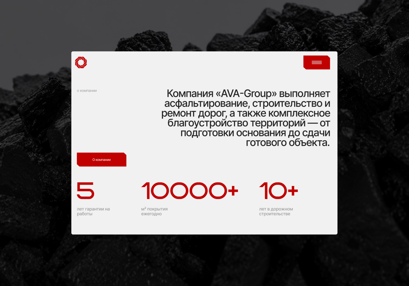
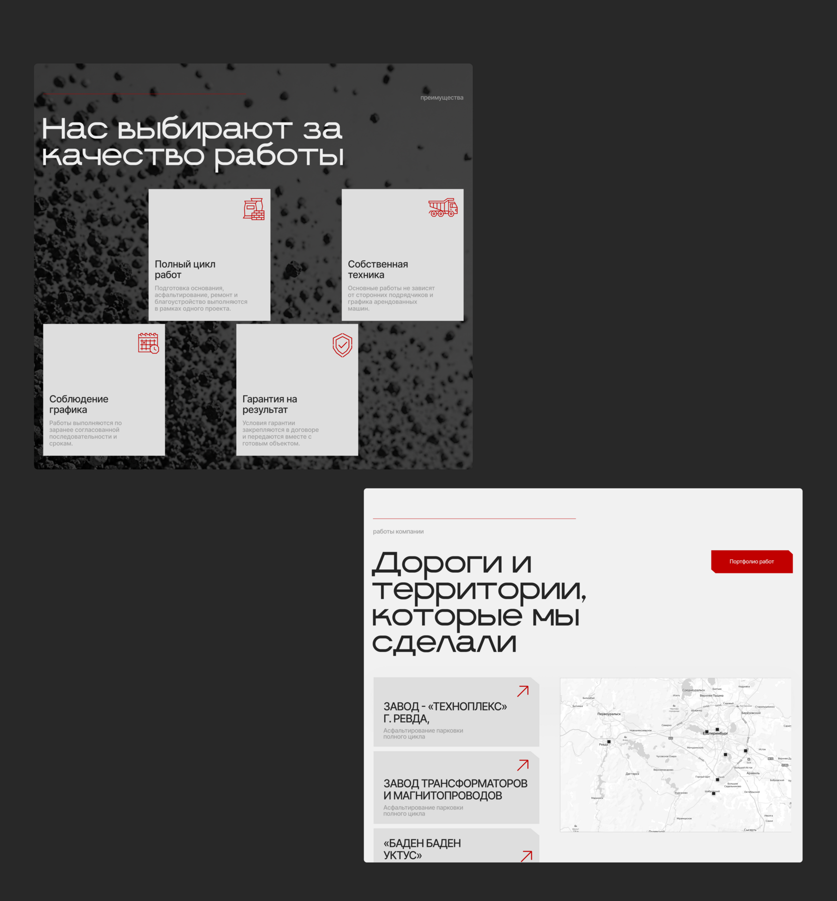
A large-scale road construction and infrastructure company needed a site that would reflect the scale of their work — not just another contractor page. The challenge was to shift perception from "local paving service" to "trusted partner for major infrastructure projects," and to rebuild the structure, style, and tone for a new era of the brand.
Identity
Built a new visual style and carried it through the logo and the site. One system, one language across every touchpoint.
Funnel & User Journey
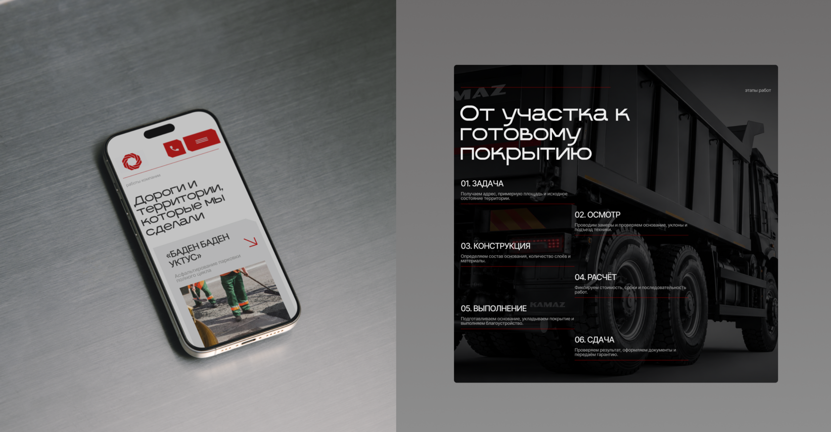
Rebuilt the funnel around a guided decision path — every block answers the next question the user actually has. Cut the expert-heavy language and kept only what a non-specialist needs. Result: conversion up 15% and average time on site grown to 3–4 minutes.
Design
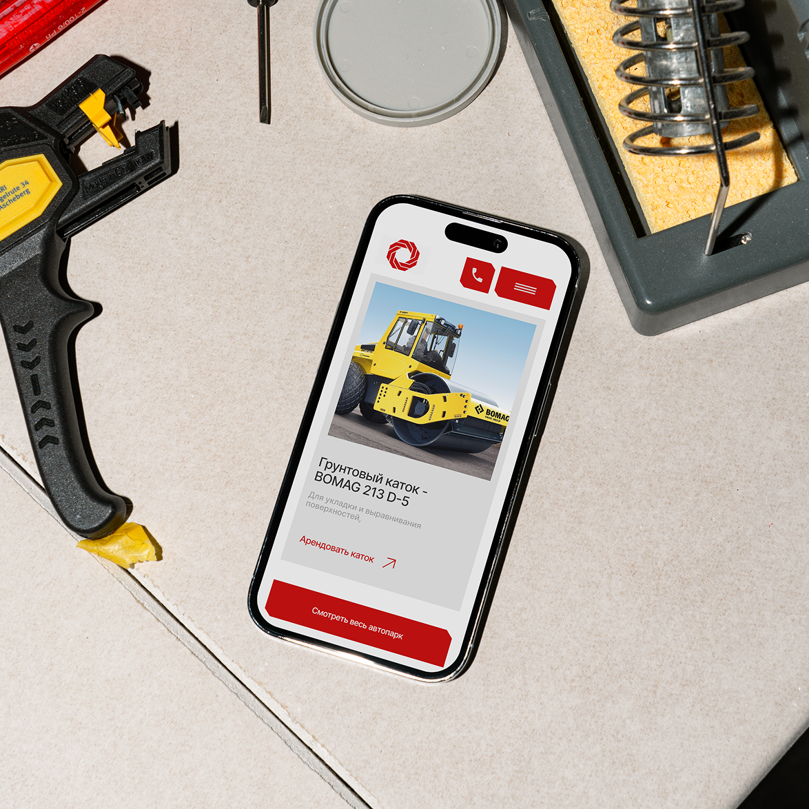
Built a visual language specifically for this brand — not a template. Clean typography, restrained palette, motion with intent. A modern interface that gives the brand a distinct, ownable presence in a conservative market.