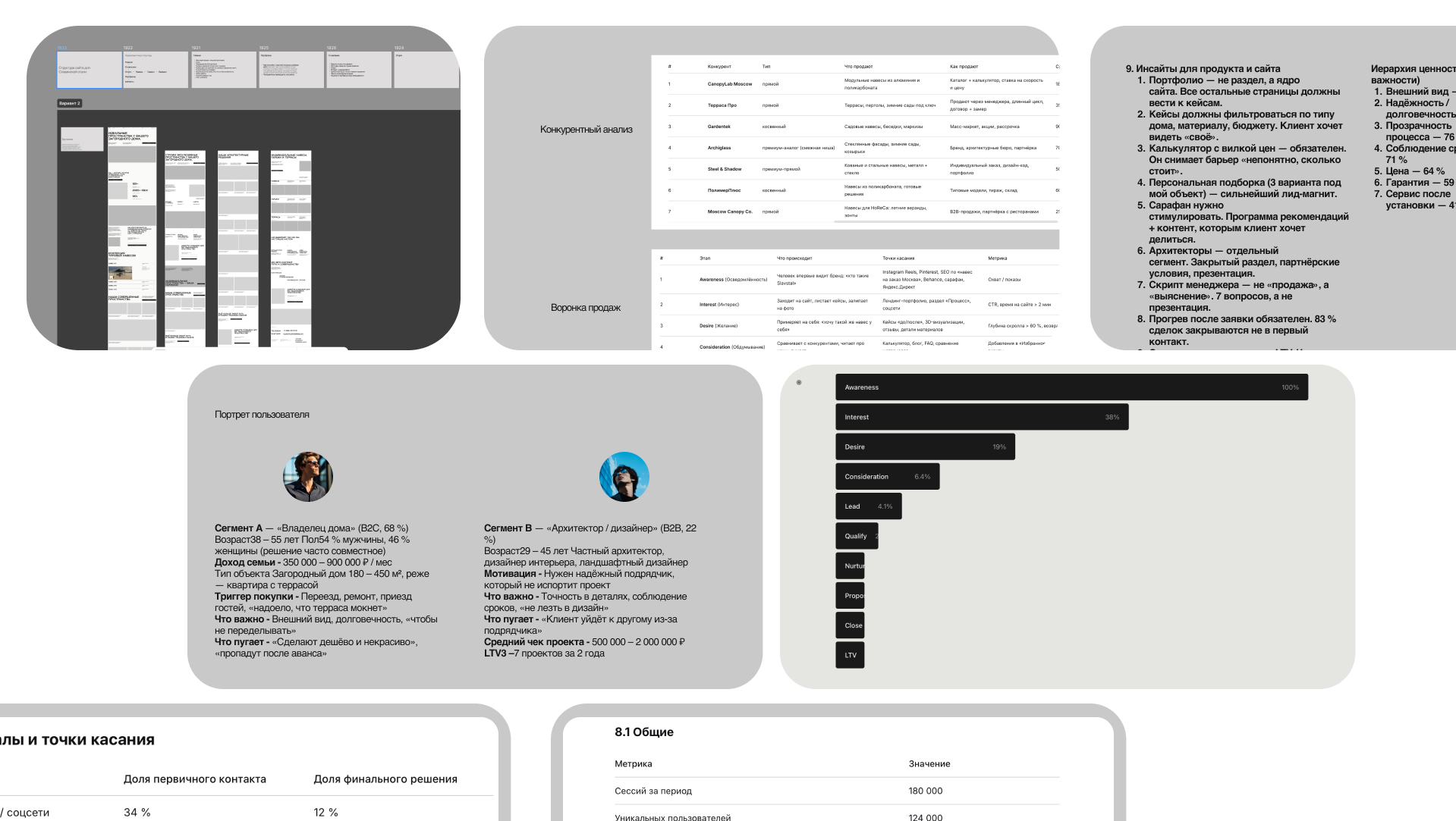
Mapped the market, studied competitors, and defined the core audience. Reviewed existing site metrics to find where users dropped off. Rebuilt the funnel and simplified the user journey. Formed key hypotheses — the new data confirmed which ones actually worked.
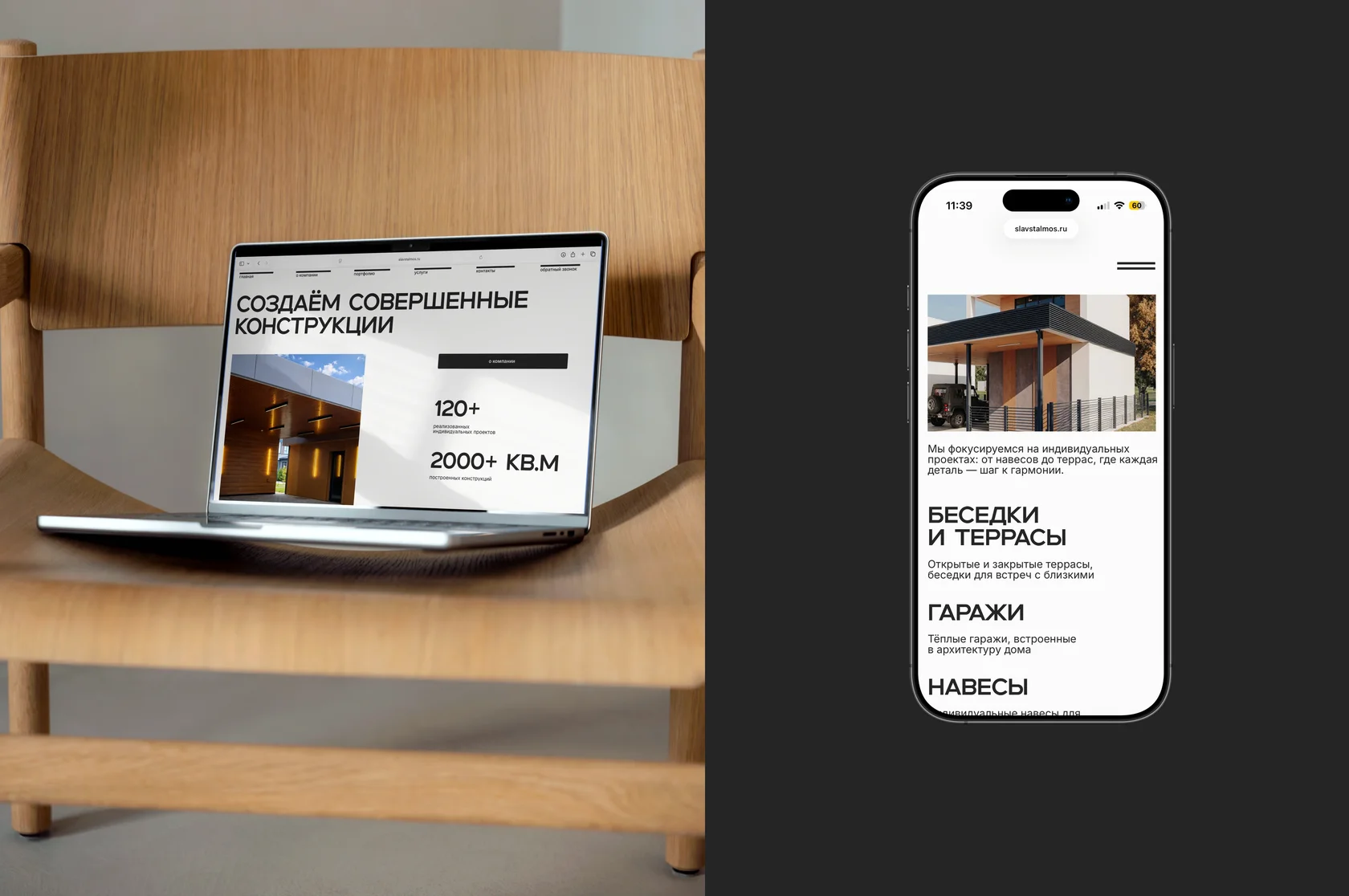
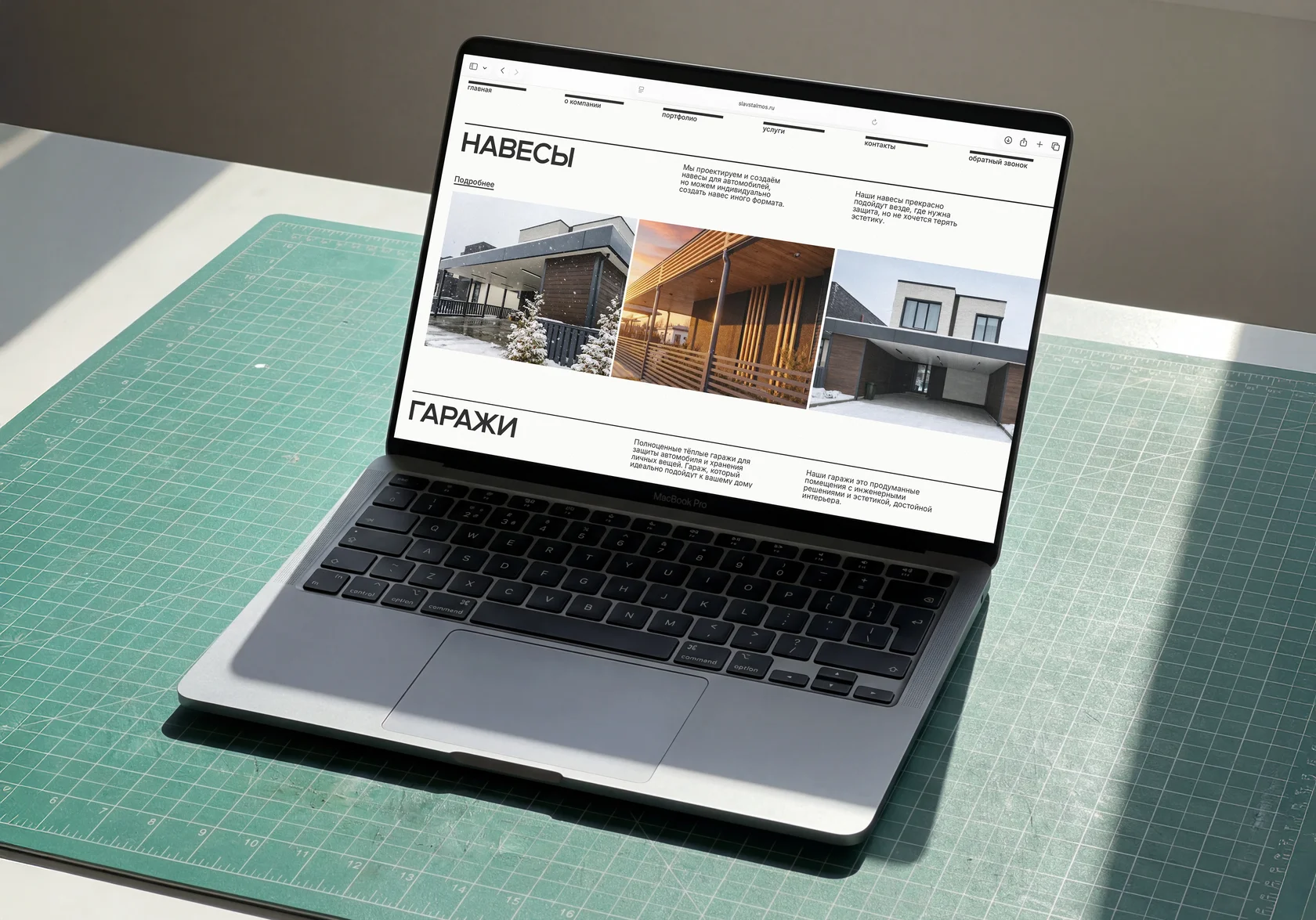
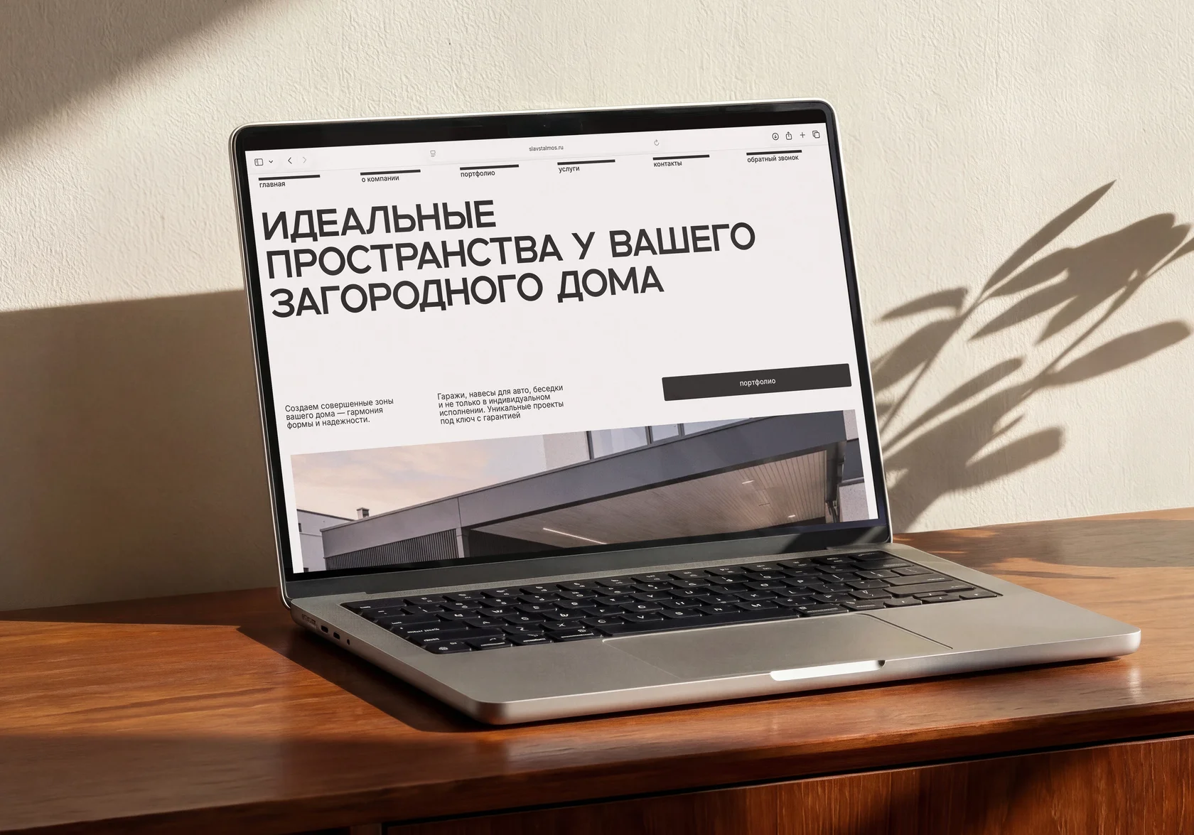
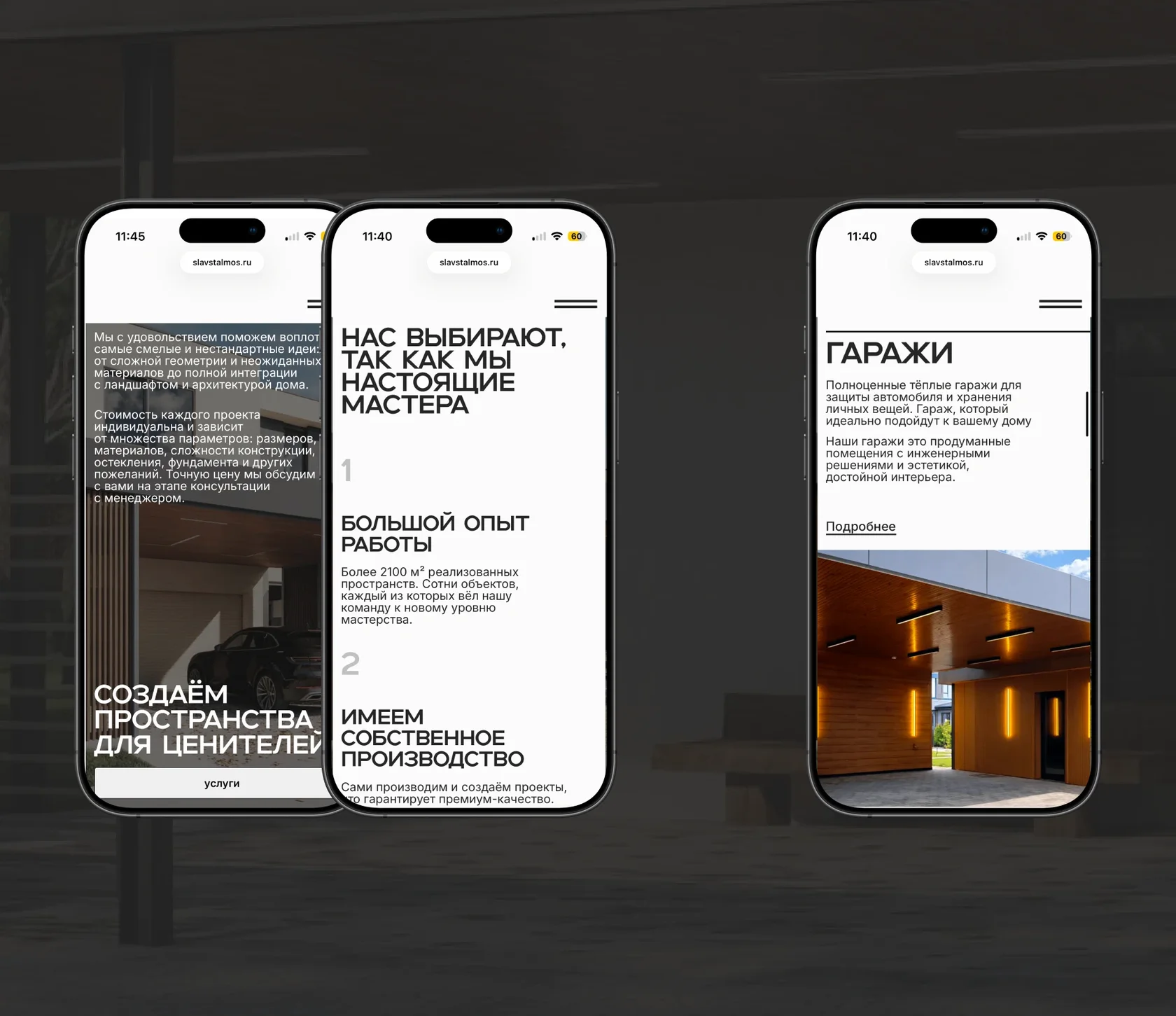
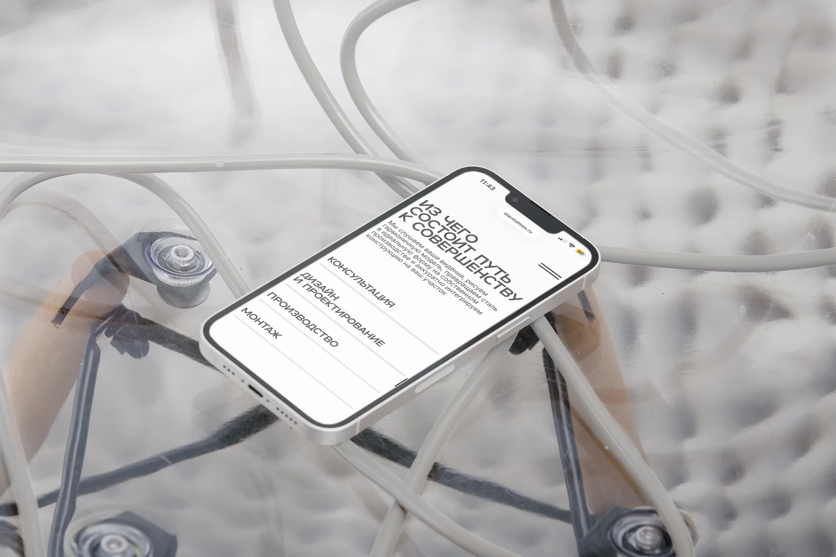
Built a clean, restrained concept using only base pure tones — no extra colors. Every accent points to the product itself: imagery and object photography carry the entire visual story. The design gave the brand a more confident, premium position in the eyes of the customer.
Two weeks after launch, conversion grew by 32%. Average visit time went from 18 seconds to about 2 minutes. Users now explore more pages per session, and the funnel moves traffic deeper into the product.